
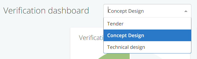
To get a visual overview of the verification activities in a project model, you can go to the verification dashboard, which you can find under ‘verification’ in the navigation menu.
See below for an explanation about what it shows and how you can work with it.
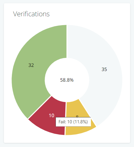
Verification outcomes per phase
The key diagram on the dashboard is a pie chart that shows the verification outcomes per project phase. The diagram shows you how many requirements have to be verified in that phase and what the outcomes are (e.g. pass, fail, etc.).
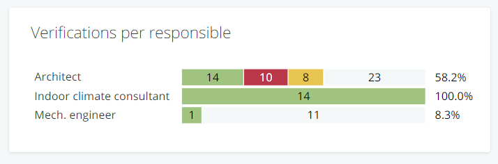
Verification outcomes per person/party responsible
This bar chart shows the same information as the pie chart described above, but broken down for the different persons/parties that are responsible for the verifications.
People you can use this chart to check their own progress and workload in relation to verification.
Other diagrams
What else you see on the dashboard, is dependent on the standard properties that have been defined in the verification set-up .
For example: if you have defined a property verification method, the dashboard will automatically feature a pie chart that show the distribution of methods over the requirements set (e.g. the number of requirements that has ‘simulation’ or ‘site acceptance test (SAT)’ as a method).
As said earlier, the colours and the categories that are shown in the diagrams are governed by the defined standard properties for verification.