In this article, we’ll explain how you can create adjacency diagrams in BriefBuilder—a diagram type that is of particular relevance when developing a design brief or architectural program for a building.
An adjacency diagram (aka bubble diagram) is a visual representation of the required adjacency relations between the spatial parts of a building. Each spatial object is visualised as a shape (e.g. a circle or a rectangle) and the relations (e.g. a proximity or connection relation) between those parts are visualized as lines.

The main purpose of an adjacency diagram is to explain how different functions or spaces should be positioned in relation to one another, typically for logistical reasons.
In an office project, for example, you may want to specify that the tea kitchen should be in proximity of the office area, or that the disabled parking should be within 15 meter from the entrance. In a rail project, it can be that you want to specify that a train station’s entrance should be within a particular distance from the bus stop, or that the ticket office should have a visual connection with the concourse area.
In BriefBuilder, adjacency diagrams are generated on the basis of the spatial objects, their sizes and the adjacency relations that can be defined in the Spaces & locations part of the model.
Below, we’ll explain the practicalities of making adjacency diagrams in BriefBuilder, starting with a short explanation of the different diagram parts.
Diagram parts
An adjacency diagram consists of the following parts:
Spaces: These are the key spatial entities of a model. In BriefBuilder, their default shape is a circle but you can easily change this (just as you can also easily change a shape’s colour, size and position).

Parent objects: These are the objects of which a space can be a part. This can be a group of spaces, a building or a location. Parent objects are always represented as rectangles.
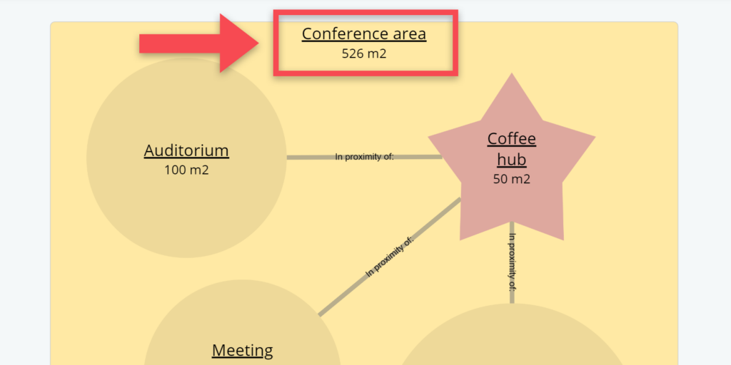
Relations: These are the relations between the different spaces as they have been defined in the model. Relations are represented as grey lines. The relation type (e.g. proximity relation or connection relation) and possible requirements concerning the maximum distance between two spaces is shown as text inside the line.

Input data
As mentioned earlier, the diagrams in BriefBuilder are created and generated on the basis of the spatial requirements that have been defined in the Spaces & locations part of the BriefBuilder model. So, before being able to create a diagram, you must first define the relevant spaces in your BriefBuilder model, incl. sizes, quantities and relations.
See below for a short explanation of how to do this (a more elaborate explanation can be found here)
(1) Go to Spaces & locations in the navigation menu
(2) Use the plus-button to create a list of spaces for your project
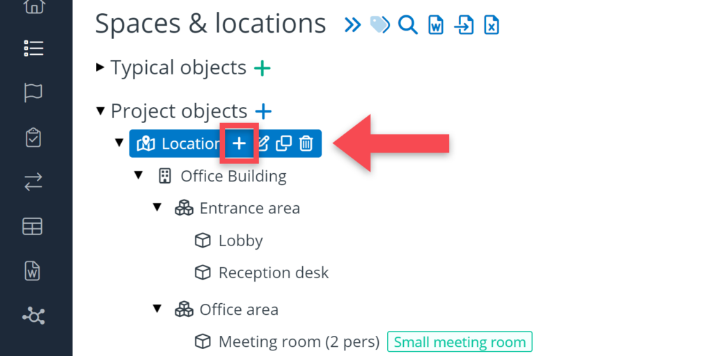
(3) For each space, you can define a quantity and a size in the table Spatial requirements on the space’s detail view.
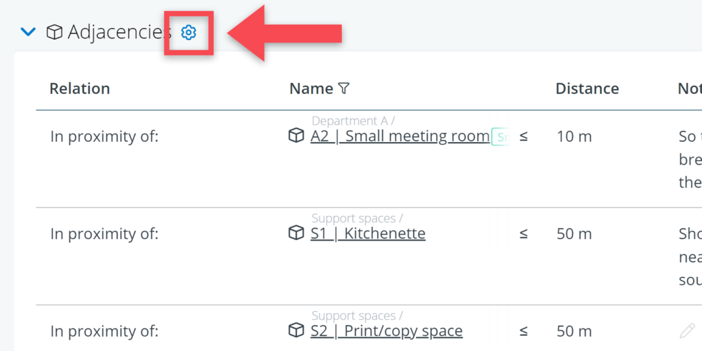
(4) For each space, you can define the relevant relations in the table the table Adjacencies.
Default relation values
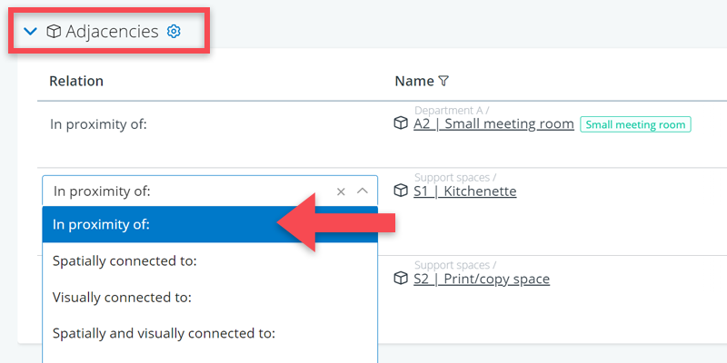
In BriefBuilder’s default set-up, you can choose from the following relation values:
- In proximity to
- Spatially connected to
- Visually connected to
- Spatially and visually connected to
- NOT connected to.
Changing relation values
You can easily modify BriefBuilder’s default relation values via the settings menu.
You can get there via the navigation menu (Settings > Requirements > Picklists for relations) or by clicking on the cog icon () in the table header (see screenshot below).
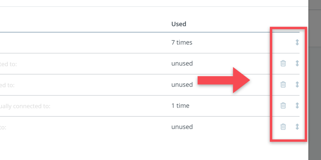
In the relation settings menu, you have to click on the picklist value icon for the adjacency relations.

To add a new relation value, click on + Add value. To change the names of the existing relation values, you can type directly in the Value field.

To delete values or to change the sequence of the values in the picklist, you can use the delete icons () and the sequence icons () respectively, which can be found at the right side of the table.
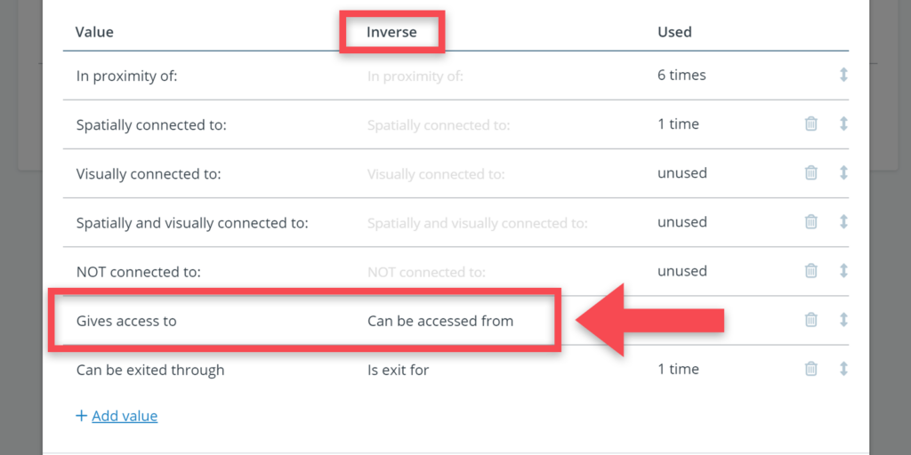
Direction of the relation
In the default set-up, all the adjacency relations are bi-directional, which means that the relation does not have a dominant direction. For example: if the building’s auditorium should be in proximity to the coffee corner, this also means that the coffee corner should also be in proximity to the auditorium.
For most spatial relations, this will make sense. There are situations, however, where you will want to add a direction to a relation. For example: in laboratory, it can be that a lab space should be accessed via an ‘airlock in’ and exited through an ‘airlock out’ to maintain a unidirectional flow of personnel, materials and waste. In such a case, just saying that these spaces should be connected will not be sufficient.
In that case, you can use the Inverted column in the value menu. By using that column, you can differentiate the value of the relation with regard to its direction. You can for example create a relation value that reads Gives access to from one direction, and Can be accessed from from the other direction. See screenshot below.

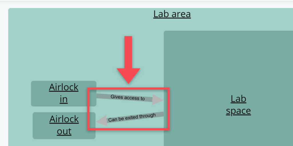
In the adjacency diagram, the relations with a direction will be shown with an arrow and the appropriate value. See example below.
Viewing, editing and creating adjacency diagrams
One you have your ‘input data’ in order, you can view and create adjacency diagrams.
To create a diagram, go to the Requirement diagrams section in the navigation menu.
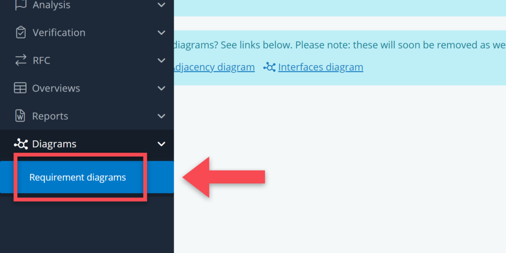
Clicking on this menu item will bring you to the requirement diagram overview page. To make a new diagram, do the following:
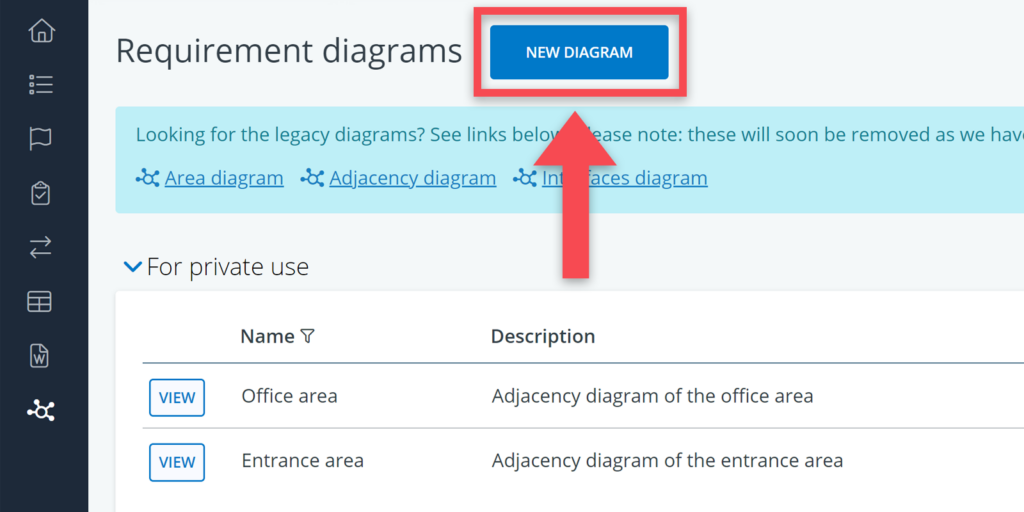
Step 1: Click on ‘new diagram’
Go to the overview page and click on the blue button at the top that reads New Diagram.
Step 2: Select Spaces & locations tree
When you have clicked on New Diagram, a pop-up window will open that shows the available trees in the model. To make an adjacency diagram, you have to choose the Spaces & locations tree.
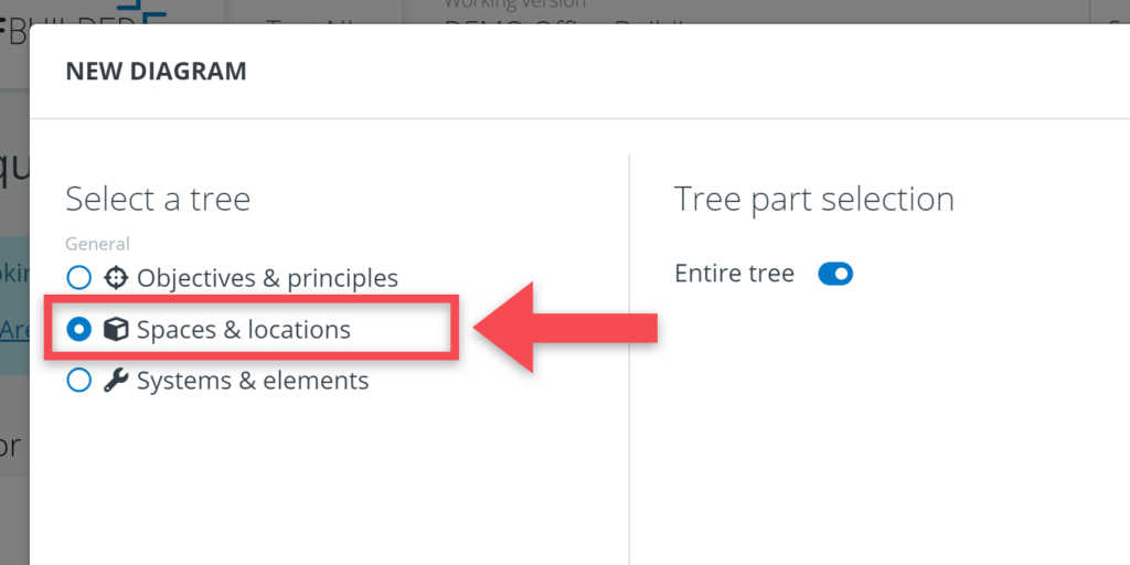
After having made your tree selection, you can move over to the right-hand side and opt for a selection of the entire tree or make a selection of objects from that tree.
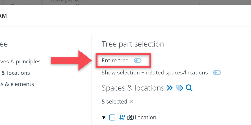
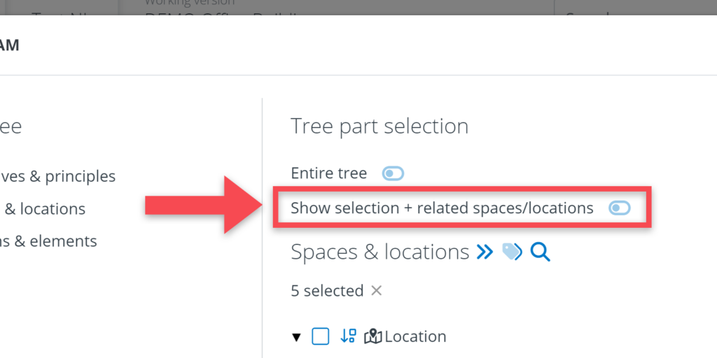
When you have made your selections, click on Continue.
Step 3: Edit your diagram
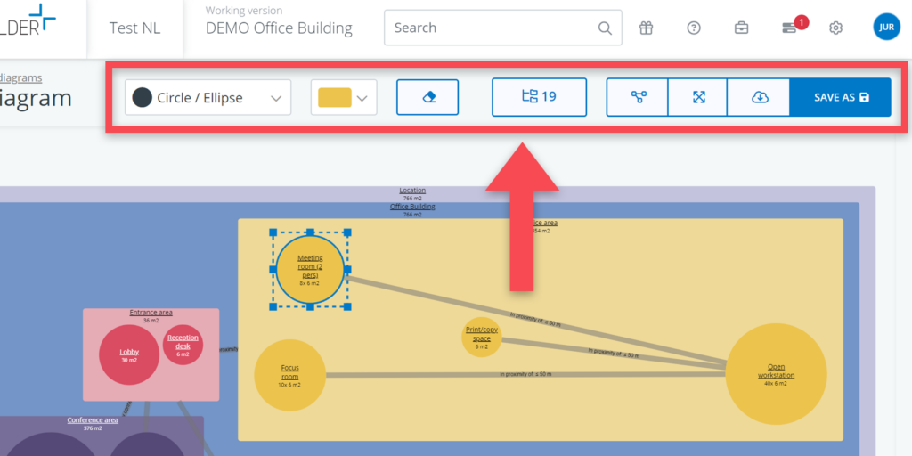
Completing step 2 will lead you to the diagram itself. As you will notice, the software will generate a diagram for you. This diagram is based on the requirements in the model, but it is quite likely that you will want to make some changes to diagram.
When selecting one or more objects with your mouse, you have the following edit possibilities:
- Moving objects (by holding down the left-click mouse button and dragging the mouse).
- Change sizes / proportions (by clicking and dragging the nodes of the selected object).
- Change colours (by selecting an object and then selecting a colour from the menu)
- Change shapes (by selecting a space and then selecting a shape from the menu)
- Removing objects (by selecting an object and clicking on the button from the menu)
- Add objects (by clicking on the button from the menu)
- Automatically rearrange the diagram (by clicking on the button from the menu)
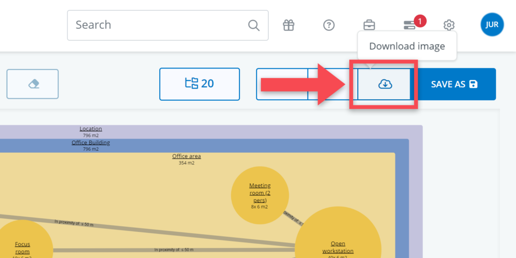
Step 4: Save your diagram
When you are finished working on your diagram, you can save your diagram by pressing the save as or save buttons at the top right of the window.
When saving as a new diagram, you will be given the option to give the diagram a name and to make your diagram available for other users.

Once you have saved your diagram, you will go back to the diagram overview.
In the overview, it is also possible to change the name of a diagram and to add description. There are controls that allow you to edit (), delete (), and change the sequence of diagrams () respectively.

The sequence button () can also be used to move a diagram from the public diagram table to the private diagram table or vice versa.